
Find the gap in the customer’s experience
A subscription gives a customer repeated reasons to judge the decision they made. The headline that persuaded them to try a product has to survive setup, everyday use, a difficult support question and the next bill. That makes a SaaS branding brief larger than a homepage, even when the agency will only redesign part of the experience.
Start by identifying where expectations and reality drift apart. Perhaps visitors understand the product but cannot see why they should switch. Perhaps the trial attracts the wrong people. Perhaps a newly acquired tool has a different name and a separate explanation of the same benefit. Those situations need different combinations of strategy, writing, identity and product work.
The examples below help you assemble that combination. They are selected projects, not a league table. An agency’s fit for your business still depends on the proposed people, research, responsibilities and working relationship.
| Where people struggle | What to bring to the agency | What the project may need |
|---|---|---|
| Understanding the offer | Sales questions, search terms, customer descriptions and competing ways to do the job. | Positioning, proposition, naming or explanation. |
| Choosing a plan or starting a trial | Pricing-page questions, sign-up journeys, abandoned steps and evidence about visitor intent. | Website structure, useful copy and interaction design. |
| Getting to a useful result | Observed setup sessions, support requests and the tasks new users are trying to complete. | Onboarding, product UX, interface language and design-system work. |
| Introducing the product to colleagues | Invitation flows, internal sales material and differences between users and budget holders. | A clearer shared story, audience-specific communication and product conventions. |
| Understanding expansion or renewal | Package changes, account communications and reasons customers give for continuing or leaving. | Product architecture, plan language and coherent lifecycle communication. |
Eight agencies, with different jobs in the mix
Focus Lab: clarify the offer before changing the name
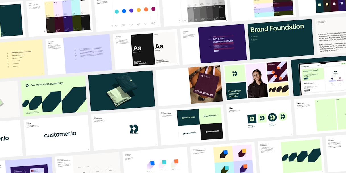
Focus Lab’s Customer.io case begins with a useful decision. The client worried that its name had become limiting. Following an audit, the agency recommended keeping it and improving the positioning and identity instead. The documented work includes a brand story, value proposition, logo and visual language.
Customer.io’s own announcement explains the shift from an individual product to a broader platform. Together, the two accounts show why the brand needed to change and why a complete renaming was not the chosen answer.
For a software team, this is a useful way to assess an agency’s judgement. Does it challenge the assumed deliverable? Ask how it would establish whether the name, the explanation or the organisation of the offer is causing the problem. Then examine the proposed implementation. The case supports verbal and visual identity work; it does not establish that Focus Lab rebuilt Customer.io’s product interface.
Ramotion: connect an existing identity to product revisions
Ramotion describes Ninox as a refresh of an existing brand. Its work extended across identity, the marketing website, illustration guidance and product interfaces. The account includes repeated UX testing and feedback from the product’s intended audience.
That makes the case relevant when the current product needs to evolve without throwing away useful recognition. Look at how the agency connects research to specific interface changes. Ask which assumptions were tested, who took part and how decisions moved into development.
Ninox’s product leader reports improvements in several usage and conversion measures on the case page. The published account does not isolate a branding effect from product changes or other influences. Treat the figures as attributed feedback, then request the measurement context if results are central to your decision. The stronger visible evidence is the joined work across brand, website and product.
Clay: a marketing website with an intelligible product story
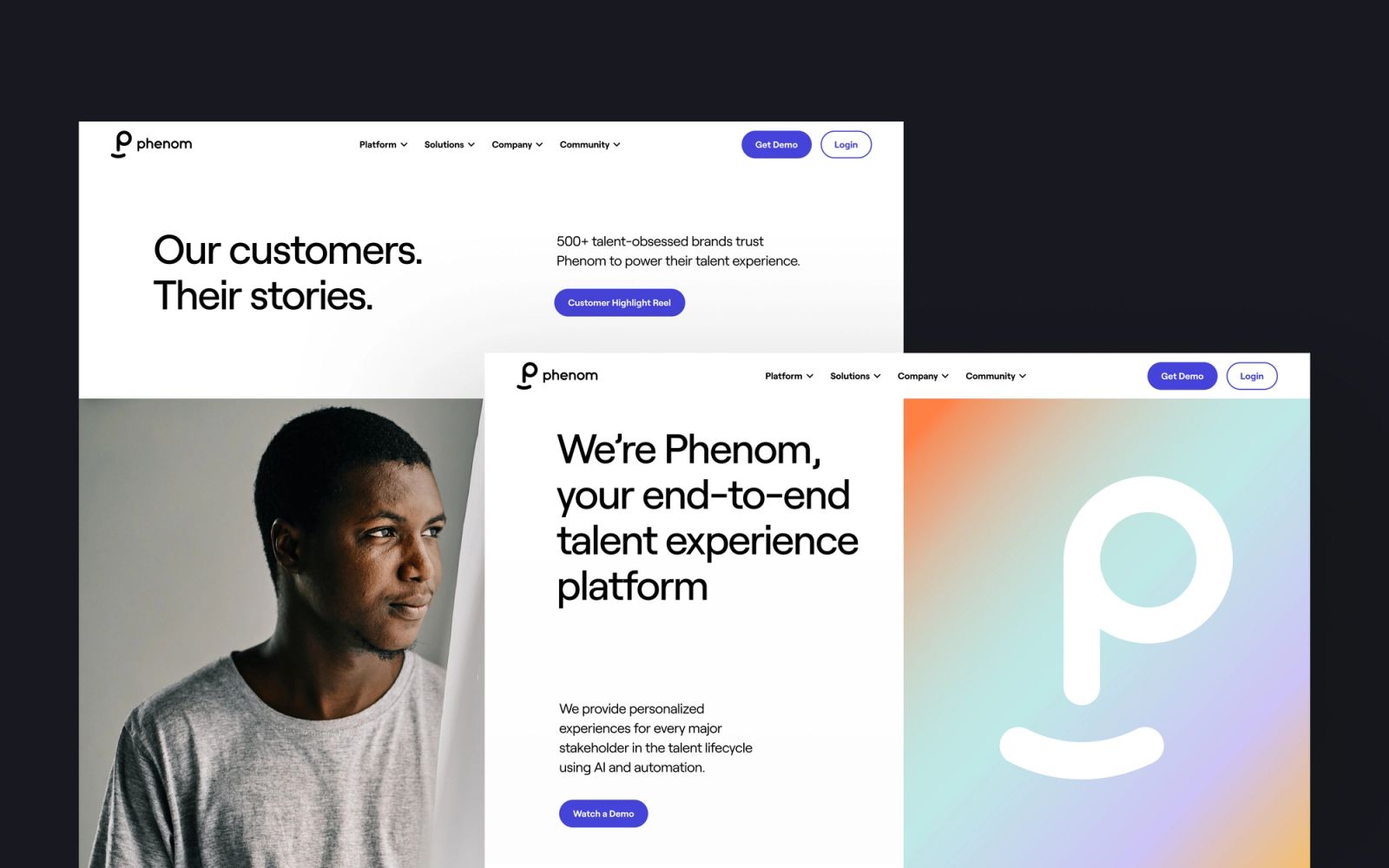
Clay’s Phenom assignment is explicitly a SaaS marketing website project. The published scope includes web and UX design, content, development and a design system. Custom iconography, animation and contrasting visual treatments help present the HR platform’s offer.
This is useful evidence when a website needs to explain several capabilities without turning into an endless feature catalogue. The work should be judged as a marketing experience. It does not, by itself, establish that Clay redesigned the underlying HR software.
In a proposal, ask the agency to show the path for a first-time visitor and for someone already comparing a specific feature. Establish how product screenshots and diagrams will be maintained, how motion supports understanding, and who can add a page once the agency has left. Those details decide whether the new site remains a useful sales tool.

Phable: an approachable identity for technical software
Phable’s Appsurify case documents an identity refresh and launch communication for a software testing business. The original work includes the double-p wordmark, rounded symbol, orange and purple palette, Prompt typography and illustrated people, with expression across website, social and marketing material.
The project offers a specific way to discuss character in a technical category. Could the agency make your product easier to recognise while keeping its explanations credible to the people who use it? Review the writing and illustrations together, rather than treating personality as a layer added after the technical story.
The current portfolio clearly labels newer product screens, physical scenes and campaign applications as concepts. They are not evidence of delivered product UX or software development. If onboarding or the working interface is part of your brief, request a shipped example with the relevant team and scope identified.
Metalab: when the product itself is the assignment
Metalab’s project archive describes working with Slack from an early prototype on its original product suite and brand. That is historical work, and a different kind of evidence from a recent corporate identity refresh. The studio’s current presentation centres on interfaces and product delivery.
Consider that orientation when people will encounter your software before they ever speak to a salesperson. The first useful action, the invitation to a colleague and the clarity of the interface can be central parts of what you need to commission.
Bring the product team into the selection process. Establish who owns research, prototypes, engineering, accessibility and the production design system. Ask for a comparable recent engagement as well as the famous archive example. A product partnership can have a substantial branding component, but the proposal needs to spell out how much brand strategy and writing it includes.
Koto: extend a recognised software identity
Koto’s Workday refresh retains and redraws the sunrise mark, adds typography and develops a broader identity around changing daylight. The published system includes office-inspired icons and applications across communication, documentation and employee-facing contexts.
This is a relevant comparison when a software brand already has recognition but its design language does too little work. The question is which familiar assets should carry forward, and how much expression different settings can support.
Request examples from the quieter end of the system: a dense document, a dashboard explanation, an email about an account change. A strong launch can show range. Routine applications show whether an internal team can use that range without turning every message into a small campaign.

COLLINS: invite a wider audience into Figma
COLLINS’ Figma assignment was a brand story and campaign about collaboration. It addressed people working alongside designers, including developers, writers and producers. The case credits the Figma team and animation partner Animade.
The distinction matters. This is evidence of expanding a product’s story around an existing recognised identity. It should not be described as a complete Figma rebrand, or as proof that an estimated audience became paying customers.
It is worth examining when a SaaS product has useful roles for people beyond its original audience. Before adopting a broader story, establish what those people can actually do in the software. Ask the agency how it would make the invitation specific, while keeping the original users comfortable with the product’s direction.
Ragged Edge: give Granola a system its team can use
Ragged Edge’s Granola work includes positioning, verbal and visual identity, digital collaboration and launch campaigns. The agency credits NaN for a script typeface developed from a co-founder’s handwriting. It also describes an internal tool that helps Granola’s team produce new collage-style illustrations.
That last detail deserves attention. Distinctive imagery can become a burden if only its original designer knows how to make it. Ask to see what the client team can produce independently and how the quality is maintained. Discuss which parts of the identity can be expressive and which should stay quiet inside the working product.
The case reports rapid growth and later investment. Those events do not establish how much the brand work caused. The design, tools and collaboration give you more concrete material for comparing an agency proposal than a funding headline.
Let the way you sell shape the scope
For a self-service product, walk through the journey from the promise on the website to the first meaningful result in the trial. Every change of language, visual system or product name deserves attention. Decide which of those inconsistencies the agency will address and which your product team will own.
For a sales-led product, include the material used between the first call and approval: demonstrations, capability explanations, customer cases, procurement information and implementation plans. The person who likes the product may have to explain it to several colleagues. Give them a story and evidence that survive that handover.
For a hybrid model, preserve both routes. An enterprise-oriented redesign should not make a straightforward trial harder to find. A lively self-service site should still help a technical evaluator establish whether the product suits a larger organisation. Ask candidates how they would organise the paths and what research would test the result.
Large portfolios and acquisitions add a separate problem: how products relate to each other. If that is the central issue, use the B2B and enterprise software guide alongside this one.
Plan the month after launch
Make a list of the things your team publishes in an ordinary month. Include release notes, help articles, product screenshots, sales decks, social images and account emails. Use that list to test the proposed identity and handover. It is a more revealing exercise than asking for another collection of pristine mockups.
Agree who maintains the brand and who maintains the product design system. They may share colour, type and voice, while requiring different rules for interaction, status and accessibility. Specify how changes move between them and who resolves disagreements.
A website handover should include the content model, editable templates and a demonstration of making a real new page. Product work needs equivalent clarity about components, states, engineering support and what is ready for production. Establish the boundary between an approved design file and a released experience before the work begins.
Also agree how existing customers will encounter the change. Renamed plans, altered navigation and unfamiliar account messages can create unnecessary questions. Communication about the change belongs in the implementation plan, even if the creative work is already approved.
Judge results against the problem you commissioned
If the problem was comprehension, evaluate whether intended buyers can explain the offer more accurately. If it was finding a suitable plan, examine that journey. If the assignment included onboarding, decide in advance what a meaningful first result looks like. Match the evidence to the actual work.
Record what else changed around launch: traffic sources, pricing, the product, sales activity and the mix of customers. An improved conversion rate can be encouraging without proving that a new identity caused it. Ask agencies presenting numerical results for the period, definition, comparison and their exact responsibility.
The same discipline helps with fees. Compare proposals against agreed research, writing, design, development, migration and support. One total may cover a website; another may include months of product work. The scope makes the price intelligible.
For a wider brief, return to technology branding agencies. If the difficult part is explaining an AI capability, use the AI guide. For the appointment itself, read how to choose a branding agency and explore candidates through the agency finder.