
Instagram’s New Logo 2026: Inside the Wordmark and Brand Identity Redesign
Instagram has introduced its first major wordmark change in a decade as part of a much wider brand identity refresh. From the controversial new script to Instagram Pen, Instagram Sans and a quieter gradient, the redesign reveals far more about the future of the platform than a new logo alone.
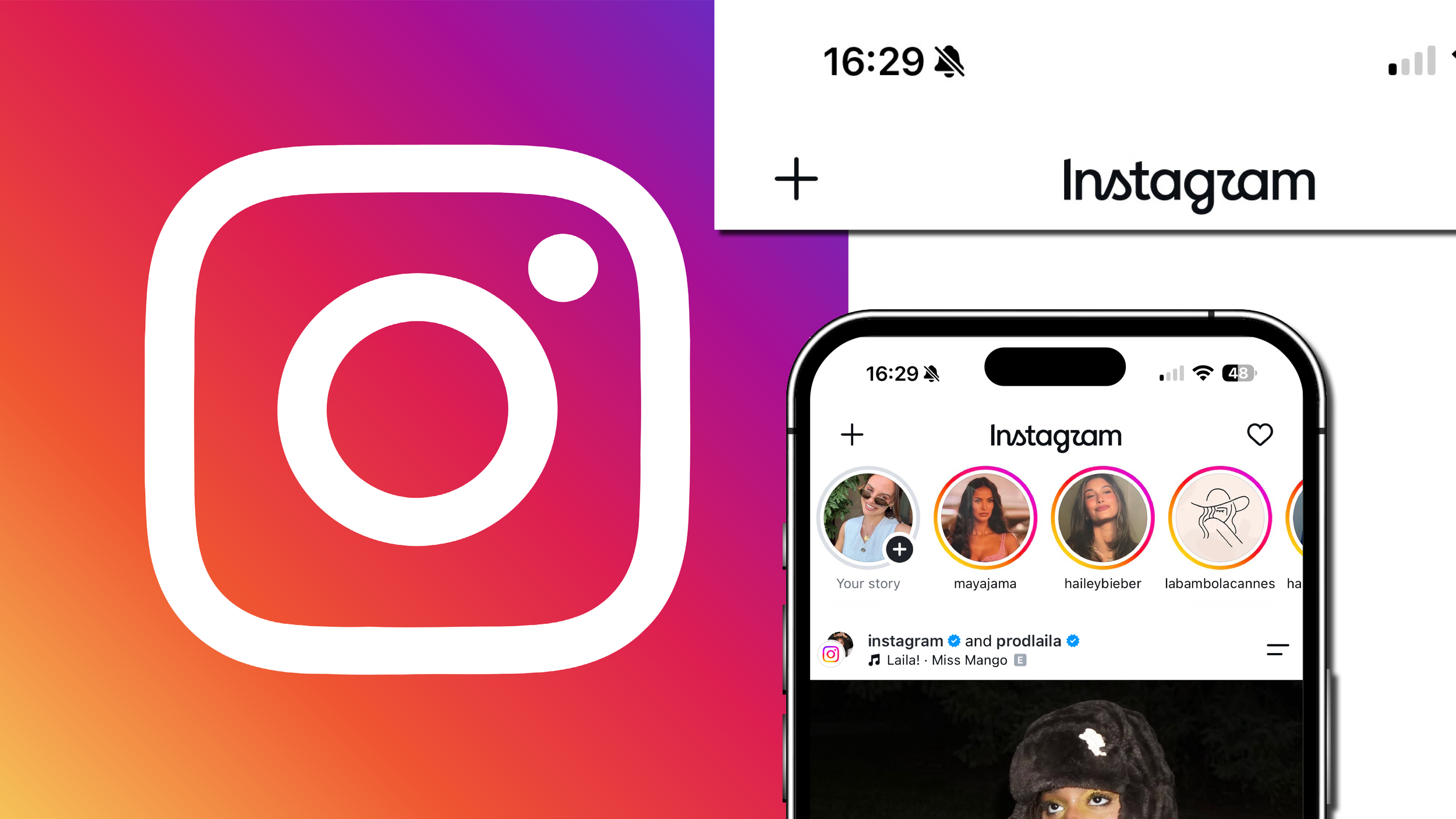
On 13 August 2026, Instagram changed one of the most familiar pieces of typography on the internet. The handwritten Instagram wordmark that had sat largely undisturbed at the top of the app for a decade was replaced by a bolder, straighter and distinctly more unusual interpretation of the name. Within hours, screenshots were circulating, designers were pulling apart individual letterforms and thousands of users had reached their own conclusion about what the new logo appeared to say: “Instagzam”.
The immediate reaction made the redesign look like a story about one controversial logo. It is not. Instagram’s new wordmark is the most visible part of a broader overhaul of the platform’s brand identity, encompassing typography, colour, layouts, motion and the relationship between Instagram’s own branding and the billions of pieces of content published within it. Alongside the wordmark comes a refined Instagram Sans, a handwriting-inspired typeface called Instagram Pen and a new monospaced typeface, while the famous Instagram gradient is being used with greater restraint. The wider system will continue to roll out through 2026 and beyond.
There is also an important distinction already being lost in some of the coverage. Instagram has not simply “changed its font”. The name at the top of the app is a wordmark, custom lettering designed specifically to represent the Instagram name. Instagram Pen, meanwhile, is a separate handwriting typeface being developed as part of the wider identity system. For a platform on which typography increasingly forms part of how people create and communicate, that difference matters.
What exactly did Instagram change in 2026?
The most obvious change is the Instagram wordmark, the written version of the company name that appears inside the app and across parts of its communications. Instagram head Adam Mosseri announced the new design on 13 August, explaining that the existing wordmark had not changed in ten years and had begun to feel dated. He described the replacement as cleaner and more modern while still referencing the simplicity and craft associated with the original.
What Instagram did not replace is equally important. The colourful rounded-square camera icon people tap to open Instagram remains in place. Search results and early news coverage have routinely described the update as Instagram’s “new logo”, which is understandable in everyday language, but technically the major visible change is to the wordmark rather than the app icon. The gradient camera symbol that has defined Instagram’s presence on smartphone screens since the landmark 2016 redesign has not been discarded.
Behind that single piece of lettering sits a considerably larger identity programme. Instagram has refined its existing Instagram Sans typeface, developed a handwriting-led Instagram Pen and added a monospaced typeface referred to in design coverage as Instagram Sans Mono or Instagram Mono. It has also reconsidered how its gradient, layouts and motion system behave, creating a visual language intended to give the community’s images and videos more space rather than allowing the platform’s own graphic assets to compete constantly for attention.
This makes “rebrand” both an accurate and slightly misleading way to describe the project. Instagram is not attempting to erase the identity people already know. Almost every significant choice appears to have been made around preserving recognition while giving individual parts of the system greater flexibility. It is better understood as an evolutionary brand refresh at enormous scale.
What does Instagram’s new logo look like?
Put the old and new Instagram wordmarks side by side and the change initially feels much more radical than it really is. The previous version was unmistakably script-led, with a continuous handwritten quality running through almost the entire name. The 2026 design introduces more upright and structured letterforms, giving much of the word a cleaner, almost sans-serif foundation, while concentrating its more expressive script gestures around particular characters and connections.
The result sits deliberately between handwriting and typography. Several letters have been simplified and made more geometric, while the distinctive curves around the “s”, “g” and “r” preserve enough irregularity to stop the mark becoming another neutral technology-company sans serif. Fast Company described the design as using cursive more sparingly, noting that while Instagram has moved away from its fully handwritten appearance, connections and flourishes still carry traces of the older identity.
That hybrid quality is precisely what makes the redesign interesting and, for some viewers, uncomfortable. Instagram is trying to achieve two potentially contradictory things within nine letters: the stability and clarity of contemporary digital typography, and the warmth, personality and individualism associated with a handmade signature. Where the previous wordmark committed fully to the latter, the replacement constantly moves between the two.
It is also why describing the redesign simply as a minimalist logo misses the point. Instagram has not followed the most obvious route available to it. The company tested more conventionally modern treatments and ultimately rejected them.

Why did Instagram change its logo after ten years?
Mosseri’s public explanation was straightforward: the wordmark had been unchanged for a decade and felt ready for a refresh. The design team’s account of the process provides a more useful explanation of what Instagram was actually trying to solve.
The team explored hundreds of possible directions, including all-capital lettering, camera-based ideas, literal handwriting and options that removed the script quality altogether. Cynthia Pratomo, director of brand design at Meta, told It’s Nice That that repeatedly stripping away the script made Instagram feel unrecognisable to its own team. Walking away from it completely, she said, felt like losing something fundamental about the brand.
That is a significant branding decision. In recent years, some of the world’s largest companies have simplified their identities by moving towards broadly similar geometric or grotesque sans-serif wordmarks. The process has become so common that “blanding” has entered the design vocabulary as shorthand for brands sacrificing distinctive characteristics in pursuit of cleanliness, flexibility and digital usability.
Instagram could easily have done the same. Instead, it appears to have concluded that the script itself had become a distinctive brand asset. The exact shape could change, but the idea of a handcrafted Instagram signature could not disappear without taking recognition with it.
Jasmine Probst, Instagram’s director of product design and one of the leaders of the redesign, described script as an expression of individuality. Her explanation is revealing because it connects the form of the wordmark to the behaviour Instagram wants to encourage on the platform: individual expression and a recognisable personal voice. The new mark, she said, was intended to be bolder and simpler while preserving an element of unexpectedness.
This is not nostalgia for its own sake. It is an example of a mature brand deciding which parts of its history have become valuable enough to protect.
Is Instagram’s new logo actually a new font?
Not quite, and this is where much of the discussion around the Instagram font change becomes confusing.
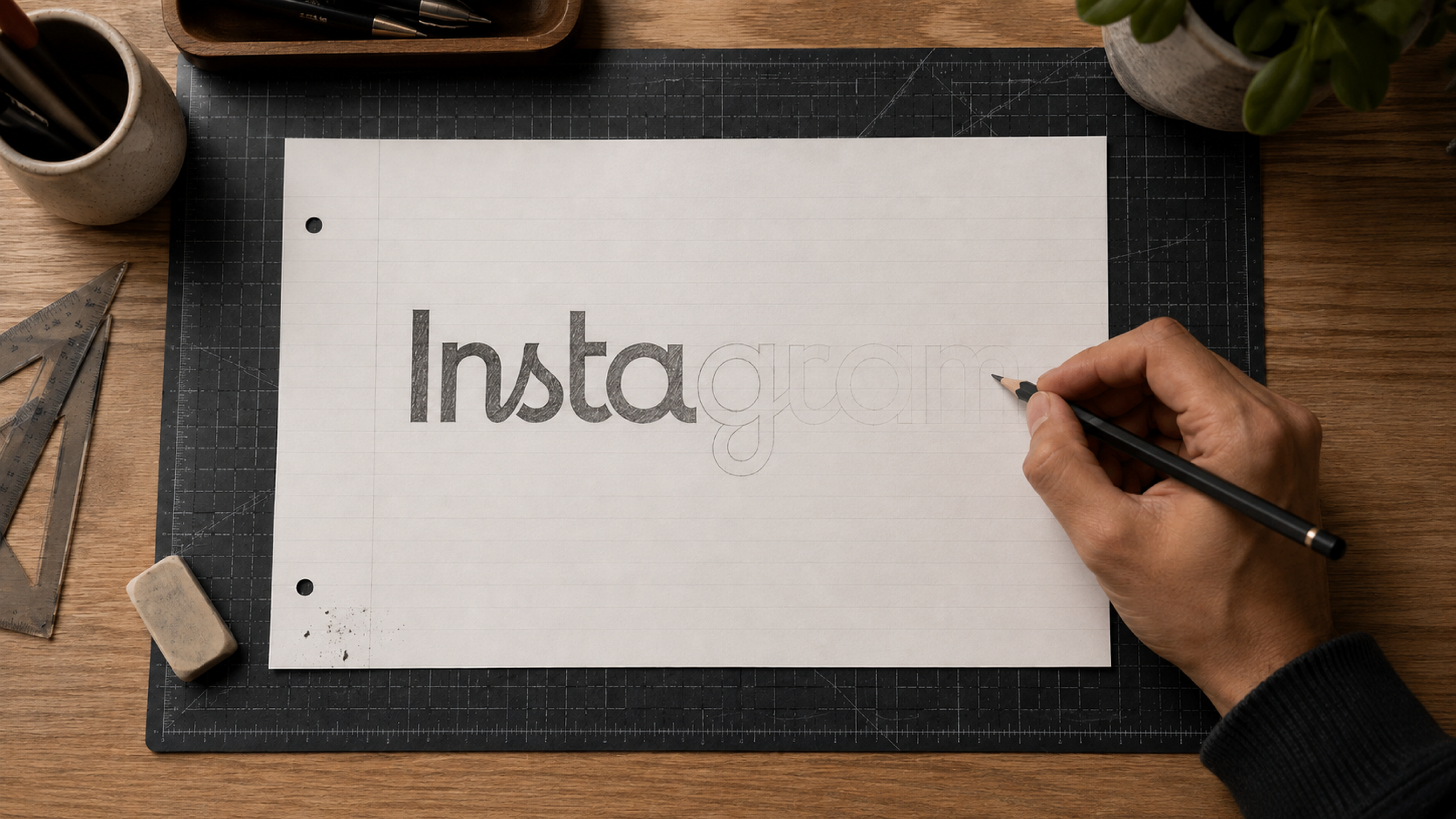
A typeface is a reusable system of letters, numbers and characters that can be used to write different words. A wordmark is a specific piece of lettering designed to represent a brand name. Instagram’s new written logo should therefore be understood primarily as a custom wordmark rather than a new font that users can simply select and begin typing with.
This distinction matters because Instagram is separately introducing and refining actual typefaces as part of the same brand refresh. The unusual lettering people see when they look at the new Instagram logo is not the same thing as Instagram Pen, nor should Instagram Pen be treated as the typeface from which the new logo was simply typeset.
For users searching “what is Instagram’s new font?”, the most accurate answer is consequently more nuanced. Instagram’s 2026 identity includes an updated Instagram Sans, the new handwriting-inspired Instagram Pen, and a new monospaced member of the system referred to as Instagram Sans Mono in detailed design coverage. The Instagram name itself is represented by bespoke wordmark lettering.
That difference may sound like design-industry semantics, but it explains the logic of the system. The wordmark has one job: to make the name Instagram recognisable. The typefaces have a much larger job, functioning across product interfaces, communications, creator tools and brand applications in potentially thousands of combinations.
What is Instagram Pen?
Instagram Pen is arguably the most strategically revealing part of the new identity.
Rather than being the new Instagram logo font, Instagram Pen is a custom handwriting typeface being developed for the wider platform. According to Instagram’s design team, the face emerged from experiments with different physical writing tools and styles, ranging from soft pencil to heavier ink marks, with the eventual aim of creating what the company describes as a warm, collective signature.
The idea did not emerge from nowhere. Instagram has previously collaborated with musicians including Rosalía and Olivia Rodrigo to translate elements of their handwriting into fonts for Stories and Reels. Instagram Pen takes that interest in personal handwriting and turns it into a more permanent component of the platform’s own visual language.
There is an intriguing cultural tension here. Instagram exists at the centre of a digital environment becoming increasingly automated, optimised and influenced by generative AI, yet one of the most prominent additions to its brand system deliberately references the physical marks made by a human hand. The irregularities of handwriting, once something digital typography worked hard to remove, are being reframed as evidence of personality.
That does not mean Instagram has explicitly positioned Pen as an anti-AI typeface. It has not. The more useful observation is that human imperfection has become increasingly valuable as a visual signifier precisely as digital production becomes more frictionless. Pencil marks, signatures, handwriting, grain and analogue photographic cues communicate authorship in a way mathematically clean design often cannot. For a social platform attempting to keep creativity and self-expression at the centre of its proposition, handwriting is an unusually logical asset to rediscover.
What changed with Instagram Sans and Instagram Mono?
Instagram Sans is not new. It was introduced during Instagram’s 2022 visual refresh, when the company created its first major proprietary type family around forms inspired by the rounded-square geometry of the Instagram camera icon. Instagram called the space between a circle and a square a “squircle”, and that geometry informed the personality of the typeface. The original system was developed with multiple global writing systems in mind and involved collaboration with typographers and language specialists around the world.
For 2026, Instagram has refined rather than abandoned that work. The updated Instagram Sans uses wider proportions, smoother curves and flatter terminals, changes that Instagram’s designers say help the family feel more grounded while preserving its recognisable character. These are deliberately subtle adjustments, the kind of typographic refinements users may register as a change in tone without consciously identifying what has happened.
A monospaced face has also joined the system. Detailed design coverage refers to it as Instagram Sans Mono, while some of the broader launch reporting uses the shortened Instagram Mono. Monospaced typography assigns equal horizontal space to characters and carries visual associations ranging from coding and early computing to captions, labels and functional editorial systems. In practical terms, its inclusion gives Instagram another distinct typographic register rather than forcing Sans or Pen to perform every role.
Together the three approaches create a useful spectrum. Instagram Sans supplies the flexible everyday voice, Instagram Pen introduces expressive handwriting, and the mono style provides a more technical or structured register. This is increasingly how major digital identities operate: not as a logo supported by one corporate font, but as a family of voices able to change tone without leaving the same brand world.
Why is Instagram using less of its famous gradient?
Instagram’s pink, orange, purple and yellow gradient is one of the most recognisable colour assets in technology, and it is not disappearing. What is changing is the amount of work Instagram expects it to do.
When the gradient became the foundation of Instagram’s dramatically simplified camera icon in 2016, it had to carry much of the emotional distance between the new symbol and the brown skeuomorphic camera it replaced. In the 2022 refresh, Instagram made the gradient brighter and more dimensional, using a 3D modelling process to create what it called an illuminated quality.
The 2026 system is more restrained. Instead of allowing intense branded colour to dominate every application, Instagram’s designers are creating what Christy Silva, creative director for design and creative marketing, has described as a simpler foundational canvas intended to elevate the creator’s story. The gradient remains an unmistakable brand signature, but it can appear selectively rather than filling every available surface.
Strategically, that makes sense for Instagram in a way it might not for a conventional consumer brand. The most important visual material on Instagram is not produced by Instagram. It is produced by photographers, fashion houses, illustrators, meme accounts, musicians, businesses and ordinary users. An identity system that constantly insists on its own colours risks competing with the very content that makes the product valuable.
A platform brand therefore has a slightly unusual challenge: it must remain recognisable while knowing when to disappear. The reduced dependence on the gradient suggests Instagram is increasingly designing itself as a frame rather than the picture inside it.
Why does the new Instagram logo look like “Instagzam”?
For all the thinking contained in the wider identity, the internet’s first response focused on one much simpler question: why does the new Instagram logo appear to say “Instagzam”?
The problem comes largely from the transition around the final letters of the word. The stylised cursive “r” uses a looping form that can be interpreted as something closer to a “z”, particularly when viewed quickly or at the small scale at which the wordmark appears inside the app. Combined with the movement into the following letters, the eye can resolve the unfamiliar shape as “Instagzam” before consciously correcting it. The reading spread rapidly after the launch and became one of the dominant reactions to the new design.
That criticism should not simply be dismissed as people being resistant to change. Legibility is a legitimate component of wordmark design, particularly when a brand has chosen to retain the appearance of handwriting while simultaneously simplifying the structures around it. When only a small number of characters carry most of the expressive work, those characters attract more visual attention, and any ambiguity becomes more pronounced.
Probst has acknowledged the criticism while defending the process behind the final design. She told Variety that Instagram had taken the design through rounds of external feedback and that the team had to balance research with creative conviction. She described the desired emotional territory as creative expression, warmth, craftsmanship and “quiet confidence”.
There is also a useful historical perspective. Instagram’s 2016 camera icon, now so familiar that it is difficult to imagine the app without it, was heavily criticised when it replaced the old skeuomorphic camera. Design changes to brands of this scale are judged first against familiarity rather than in isolation. That does not guarantee that “Instagzam” will disappear from view, but it does mean immediate public reaction is an unreliable measure of long-term success.
The Instagram logo before and after: what has really changed?
The most important difference between the old and new Instagram wordmarks is not that one is script and the other is sans serif. Both contain elements of handwriting. The difference lies in where that personality is concentrated.
The previous wordmark behaved much more like a continuous signature. Its letters belonged to the same handwritten rhythm, producing a mark that was recognisable even when relatively small. The new version gives the more conventional letterforms greater structural clarity, then interrupts them with a handful of much more expressive gestures.
That produces a different kind of recognition. Instead of asking the whole word to be distinctive, Instagram is concentrating memorability into a smaller collection of shapes. From a branding perspective, that can be powerful: distinctive assets often work because people learn fragments rather than memorising complete compositions. The risk is that the fragment has to remain readable enough to perform its basic function.
Instagram’s internal explorations suggest the company was acutely aware of the recognition problem. The design team reportedly experimented with abandoning script entirely, only to find that the result ceased to feel sufficiently like Instagram. The final hybrid can therefore be read as a compromise, but compromise need not be a criticism. At this scale, brand design is often precisely the process of negotiating how much recognition can be disturbed without breaking continuity.
A short history of the Instagram logo
Instagram’s visual identity has always reflected what the platform believed it was at a particular moment. When Instagram launched in 2010, its skeuomorphic camera icon made perfect sense for an app built around taking photographs and applying filters intended to make digital images feel more like analogue prints. The visual metaphor was direct: Instagram was a camera in your pocket.
The written identity also evolved early. In 2013, designer Mackey Saturday redrew Instagram’s existing script into a more refined custom wordmark. Saturday described the aim as maintaining the qualities people already associated with Instagram while making the lettering more durable and better able to support the brand as it expanded. His ambition was explicitly long term, looking towards enduring script identities such as Coca-Cola, Campbell’s and Kellogg’s rather than chasing a contemporary typographic fashion.
The more dramatic transformation arrived in May 2016. By then, Instagram had grown far beyond a retro photo-filtering application. Under then head of design Ian Spalter, the company replaced the detailed camera with the simplified gradient icon still recognisable today. Instagram’s team used memory exercises to identify which parts of the old camera people actually retained, finding the lens, viewfinder and rainbow among the essential elements. Those features were abstracted rather than erased.
In 2022, the platform revisited the system without performing another wholesale replacement. The gradient became brighter, Instagram Sans was introduced, and layouts were made increasingly content-forward. The 2026 refresh continues that pattern of evolution. This time the camera icon survives almost untouched while the wordmark and supporting system move forward.
Viewed as a sequence, Instagram’s identity has changed less chaotically than the backlash surrounding each individual redesign might imply. At every important stage, the company has identified an established visual asset, simplified or reinterpreted it, and then carried enough of the previous identity forward to preserve recognition.
The bigger story is Instagram’s brand system, not its logo
Logos attract attention because they are easy to compare. Place an old version on the left and a new one on the right and an entire redesign can be reduced to a single image. Brand systems are harder to compress, but they increasingly matter more.
Instagram today has to function across a vast range of environments: the main app, Stories, Reels, creator tools, campaigns, websites, events, partnerships, motion graphics and communications in different languages and markets. A single wordmark cannot solve those problems. The real test of the 2026 redesign will therefore be whether Instagram Sans, Instagram Pen, the mono face, the gradient, motion and layouts can create coherence without making every piece of Instagram look identical.
May Hartono, Meta’s director of brand design and another leader of the refresh, has framed the new system around putting the community’s creativity and self-expression at the centre. That language can sound familiar in a corporate brand announcement, but the design choices make the intention more concrete. The branded colour is quieter, the typography provides several voices rather than one, and the layouts are designed to support material created by other people.
In that sense, Instagram is designing less like a traditional media brand and more like a stage. The visual identity has to tell you where you are without insisting that it become the thing you are looking at.
Is Instagram becoming more like Meta, Facebook and Threads?
The new wordmark has also prompted comparisons with other companies in Meta’s portfolio. The more structured portions of the lettering inevitably make Instagram feel closer to the cleaner typography associated with Meta’s other brands, and Fast Company observed that the introduction of more sans-serif characteristics brings the mark visually nearer to sibling platforms.
It would be too simplistic, however, to interpret the redesign as an attempt to make Instagram look like Facebook or Meta. Probst has said the wordmarks across Meta need to reflect their individual applications while still sitting comfortably within a broader family. She described the Instagram project as being focused specifically on the Instagram community while remaining compatible with Meta’s wider brand environment.
That distinction is important. Brand architecture does not require every subsidiary or product to use the same typeface, colour palette or visual tone. In fact, forcing Instagram, WhatsApp, Facebook and Threads into an obviously uniform visual system would risk weakening the cultural identities that make each product valuable. The more sophisticated approach is to create enough underlying order that the brands feel related without making them interchangeable.
Instagram’s retained script may be the clearest example of that strategy. It supplies exactly the kind of individual asset that prevents the platform from dissolving into its corporate parent.
What the Instagram redesign tells us about branding in 2026
Perhaps the most useful thing about Instagram’s new identity is that it resists a tidy interpretation. It is simultaneously cleaner and more eccentric, more digital and more interested in handwriting, less visually dominant and more deliberate about its own distinctive assets. Those apparent contradictions are likely closer to the realities of contemporary brand building than another universal rule about whether logos should be simple or expressive.
The first lesson is that recognition is not the enemy of change. Instagram explored radically different directions, but when the disappearance of script made the brand feel unrecognisable, it changed course. For marketers, the relevant question is not whether an old asset looks fashionable. It is whether audiences have learned that asset so thoroughly that removing it would destroy value that has taken years to build.
The second lesson is that simplicity does not have to mean anonymity. The endless migration towards neutral sans-serif wordmarks was partly driven by legitimate needs around interfaces, small screens and global consistency. Instagram’s response is not to reject simplicity, but to reserve moments of strangeness within it. The disputed “r” may ultimately prove too strange, but the underlying principle is sound: a system can be clean without sanding away every proprietary characteristic.
The third is that humanity is becoming a more deliberate design choice. Instagram Pen, the preserved script and references to writing instruments arrive at a moment when synthetic imagery, automated content and algorithmic systems are becoming ordinary parts of digital culture. Brands may increasingly need visual signals that suggest authorship, touch and individual voice. The polished perfection that once made a technology brand feel advanced can now make it feel generic.
Finally, the redesign demonstrates the growing importance of brand systems that know when to recede. Instagram’s quieter use of its gradient is arguably a more consequential decision than changing the wordmark. In a creator-led environment, the platform does not need to be the loudest visual participant. Its identity succeeds when users recognise the room they are standing in without the wallpaper competing with everything they came to see.
Was Instagram right to change its wordmark?
Judged solely as a piece of lettering, Instagram’s new wordmark is not an uncomplicated success. The “Instagzam” reading exposes a genuine legibility problem, and the collision between structured characters and expressive cursive gestures will inevitably feel less resolved to some eyes than the continuous rhythm of the previous script.
Judged as part of the full identity, however, the decision is considerably more convincing. Instagram resisted removing an asset that had accumulated enormous recognition, but it also resisted treating heritage as something that could never be touched. The script survives as an idea rather than as a museum piece, while the supporting typography and colour system become more capable of adapting to the platform Instagram has become.
The best rebrands rarely make their strongest argument in a before-and-after image. They prove themselves through repeated use. Instagram’s 2016 camera icon is evidence of that: an identity that produced immediate resistance eventually became so familiar that the company now has little reason to disturb it.
Whether the same happens with the 2026 wordmark will depend on what happens after the jokes fade. If “Instagzam” remains the first thing viewers see, Instagram may eventually have a letterform problem to solve. If familiarity takes over, the controversy will become a footnote to a more significant shift: the moment Instagram stopped treating its identity as a logo and began treating it as a flexible language for a platform built by everybody else.
Quick answers: Instagram’s 2026 logo and font update
Did Instagram change its logo in 2026?
Yes. On 13 August 2026, Instagram introduced a redesigned wordmark as part of a wider brand identity refresh. The familiar gradient camera app icon was not replaced. The main visible change is to the written “Instagram” logo that appears within the app and in brand communications.
What is the new Instagram font called?
There is no single “new Instagram font”. Instagram’s 2026 brand system includes a refined Instagram Sans, a new handwriting-inspired typeface called Instagram Pen and a new monospaced face. The redesigned Instagram name itself is a custom wordmark rather than simply text typed in Instagram Pen.
What is Instagram Pen?
Instagram Pen is a new custom handwriting typeface being developed as part of Instagram’s refreshed brand system. The design team experimented with physical handwriting styles and writing tools to create a warm, deliberately imperfect typographic voice intended to support creative expression across Instagram.
Why did Instagram change its logo?
Instagram says its existing wordmark had been largely unchanged for a decade and needed to feel more contemporary. Its designers explored hundreds of directions but retained script characteristics because removing them made the identity feel less recognisably Instagram.
Why does the new Instagram logo say “Instagzam”?
It does not actually say “Instagzam”, but many viewers have interpreted the stylised cursive “r” as something closer to a “z”. The ambiguous letterform and the way it connects visually with the surrounding characters caused “Instagzam” to become a widespread nickname for the redesign immediately after its launch.
Did Instagram change its app icon?
No. The familiar rounded-square camera icon with Instagram’s pink, orange, purple and yellow gradient remains in use. The August 2026 change primarily affects the Instagram wordmark and its broader visual identity system.
Who designed Instagram’s new logo?
The 2026 refresh was led by Instagram and Meta’s internal design teams, with Jasmine Probst, Instagram’s director of product design, and May Hartono, Meta’s director of brand design, among the leaders publicly associated with the project. Cynthia Pratomo and Christy Silva have also discussed the development of the wider brand system.
FAQ’s about the Instagram rebrand
When did Instagram introduce its new logo?
Instagram unveiled the new wordmark on 13 August 2026. The wordmark began rolling out globally immediately, while other components of the refreshed identity are expected to appear progressively through 2026 and beyond.
Is Instagram Pen the font used in the new Instagram logo?
No. Instagram Pen is a separate handwriting-inspired typeface within Instagram’s broader brand system. The Instagram logo is bespoke wordmark lettering and should not be confused with the reusable Instagram Pen typeface.
Is Instagram Sans a new font?
Instagram Sans itself is not new. Instagram originally introduced the custom typeface during its 2022 visual identity refresh. The family has been refined for the 2026 system, with adjustments including wider proportions, smoother curves and flatter terminals.
What is Instagram Mono?
Instagram’s refreshed typography system includes a new monospaced typeface. Detailed coverage of the identity refers to the family as Instagram Sans Mono, while some launch coverage has shortened the name to Instagram Mono. It provides a more structured typographic voice alongside Instagram Sans and the handwriting-led Instagram Pen.
When did Instagram last change its logo?
Before the 2026 wordmark update, Instagram’s most famous major identity change happened in 2016, when the old skeuomorphic camera icon was replaced by the simplified gradient camera design. Instagram also introduced a substantial visual refresh in 2022, including Instagram Sans and an updated gradient.
Why did Instagram keep a script logo?
Instagram’s designers explored options without script but found that removing the handwritten quality made the brand feel less recognisable. Script had become part of Instagram’s distinctive identity, while also supporting the concepts of individuality and personal expression that the company wanted the new system to communicate.
Is the Instagram gradient changing?
Instagram’s signature gradient remains part of the identity, but it is being used more selectively. The broader 2026 system creates a quieter visual canvas intended to give creator content greater prominence instead of surrounding everything with strong branded colour.
Is Instagram’s new logo permanent?
Instagram has presented the wordmark as part of its new global brand identity rather than a temporary experiment. The company says the wider identity will continue rolling out through 2026 and beyond, although, like any digital brand, individual elements could be refined in future.