
Why AllSaints is stripping back its brand to stand out again
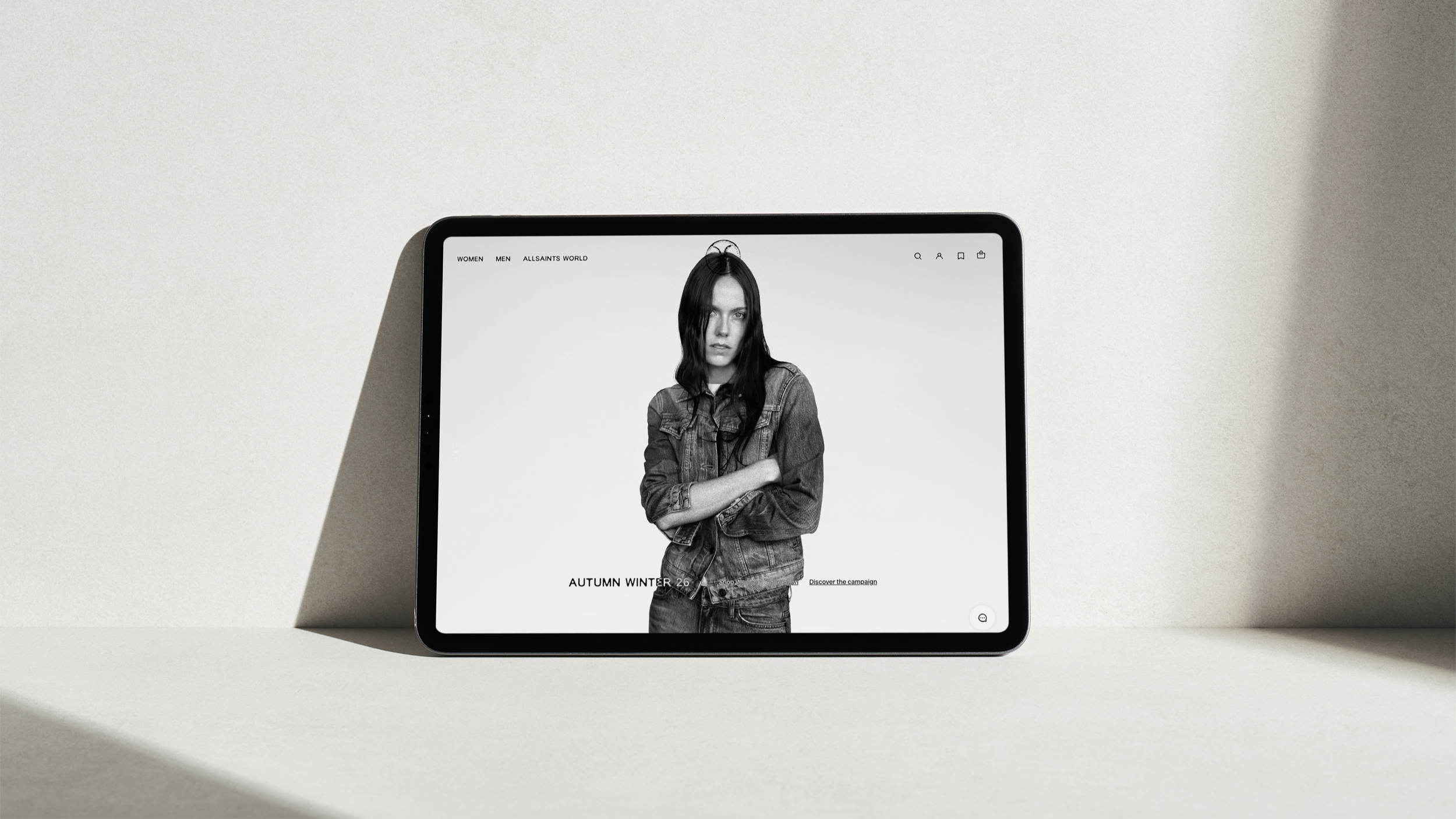
Allsaints.com website redesign
AllSaints has wiped its Instagram history, redesigned its website, revived the Ramskull and returned to stark black-and-white photography under new chief creative officer Aaron Esh. Yet what is happening at the British fashion brand is more interesting than a conventional rebrand. AllSaints appears to be stripping away years of accumulated noise in order to rediscover the codes that made it distinctive in the first place.
There was a time when you could recognise AllSaints before you had seen the name. Washed leather, grey denim, distressed boots, industrial stores and walls of antique sewing machines came together with a particular East London attitude that made the brand difficult to confuse with anyone else. AllSaints did not simply sell clothes; at its strongest, it sold membership of a recognisable tribe, positioned somewhere between Spitalfields, a guitar case and staying out considerably later than intended.
Some of those associations eventually became clichés, but that was partly because AllSaints had established them so successfully. Its combination of distressed leather, skinny silhouettes and darker British rock culture became embedded in the visual language of the 2000s, to the point that the things that once made the brand feel contemporary gradually became capable of making it feel nostalgic instead.
That is the problem facing Aaron Esh, the East London designer who joined AllSaints as chief creative officer and whose first collection for the company arrived on 1 September 2026. Alongside Autumn Winter 2026 came a new campaign, refreshed visual identity, redesigned website, renewed prominence for the Ramskull and a broader editorial and cultural programme. AllSaints itself describes the collection as introducing a new brand identity, although Esh has resisted the idea that he is simply replacing the old one. His description is closer to reclaiming what AllSaints was and finding a way to make those qualities relevant again.
That distinction matters. AllSaints is not attempting to escape its history. It is editing it.
Is AllSaints rebranding?
By most conventional measures, the answer is yes. The visual system has changed, there is a new logo treatment, the website has been rebuilt, the social presence has been reset and the clothes themselves have undergone substantial redevelopment. Esh has also overseen the copy and digital experience, while AllSaints World has been introduced as an editorial platform and a physical publication called The Ram is being launched as part of the wider cultural programme.
What makes the exercise more interesting is that it does not appear to begin with rejection. Many rebrands are based on the premise that the previous identity has become strategically limiting, aesthetically outdated or commercially inconvenient, and the solution is therefore to replace it. AllSaints is taking a more selective approach by returning to its own archive and asking which elements still possess enough meaning to deserve another life.
Leather remains fundamental. Denim remains. The Ramskull remains. London, particularly the brand's relationship with Spitalfields and the east of the city, remains a central part of its story. The darker sensibility that historically separated AllSaints from more polished fashion has also survived, but the way these assets are being combined and presented has changed considerably. AllSaints itself describes archival styles as being “reworked, refitted and rebuilt, rather than reproduced”, which could just as easily describe the branding strategy as it does the clothes.
It is therefore more useful to think of what is happening as a form of brand archaeology. Esh is digging through the history of AllSaints, deciding which pieces are genuinely proprietary and separating them from the stylistic baggage that accumulated around them.
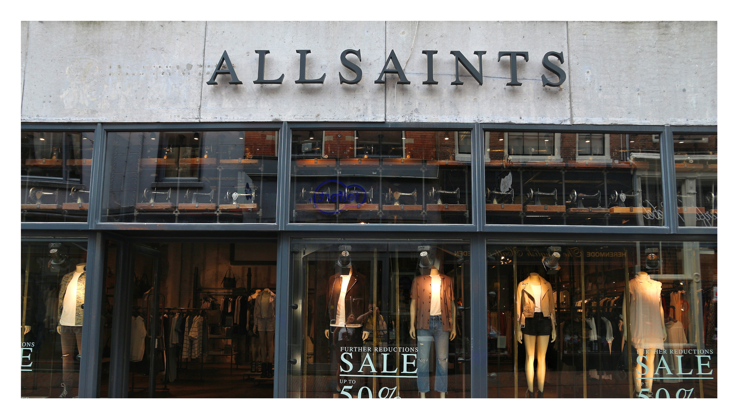
AllSaints store, Netherlands
The problem with being recognisable but no longer distinctive
AllSaints did not arrive at this point as an obscure business in need of awareness. It remains an international fashion company with significant commercial scale, and Vogue reported revenue of £441.3 million for 2025. The challenge is less about whether consumers know AllSaints exists and more about what the name means to them when they encounter it.
Recognition and relevance are not the same thing. A company can remain famous while the cultural meaning surrounding it gradually weakens, particularly when the visual codes that made it successful become closely associated with a particular period. Consumers may still recognise the logo and understand the product, but recognition alone does not guarantee the kind of desire that allows a fashion business to keep moving forward.
For AllSaints, that tension is unusually visible because so much of its original identity became synonymous with a certain period of British fashion. Skinny jeans, weathered leather, washed-out palettes and indie rock references can now evoke nostalgia as readily as aspiration. Simply reproducing them would risk turning AllSaints into a tribute act to itself, while removing them altogether would discard precisely the assets that made the brand distinctive.
Esh's approach appears to recognise that difference. The question is not how to make AllSaints look unlike its past, but which parts of that past belong uniquely enough to AllSaints to remain useful now.
The new campaign puts people before product
The clearest expression of that idea may be the Autumn Winter 2026 campaign photographed by Alasdair McLellan, styled by Katy England and art directed by Jamie Reid. Rather than constructing a polished fashion cast around a narrow idea of the ideal AllSaints customer, the campaign consists of 17 portraits bringing established models together with people street-cast from across London. Artists and students appear alongside a carpenter, dancer, skater, photographer, rapper, fashion designer, retail worker and others whose lives sit well beyond the usual boundaries of fashion casting.
The occupations matter because AllSaints has chosen not to disguise the lives behind the faces. The campaign identifies people through names, neighbourhoods and what they actually do, placing a fine art student from Harrow or a skater from Leyton within the same visual world as professional fashion talent. It creates a picture of London that is built through people rather than the predictable shorthand of taxis, pubs, brick walls and famous streets.
Age is approached in much the same way. AllSaints describes the campaign's characters as possessing a youthfulness that is not restricted by age, which is a more interesting proposition than simply inserting a range of generations into a campaign for the sake of visibly demonstrating diversity. The idea is that something shared in their attitude connects them even when their ages, professions and personal styles do not.
Esh has been explicit about the thinking behind this. He has said that he is less interested in defining the AllSaints customer by age or demographic and more interested in character, with the ultimate ambition that somebody could walk down the street with no visible logo and still appear unmistakably “AllSaints”.
It is a useful distinction for branding more broadly. Marketing has become extraordinarily good at defining audiences through age, income, postcode, interests and behaviour, but knowing precisely who is likely to buy something is not the same as building an identity that people want to belong to. Great fashion brands often create recognisable characters rather than simply target consumers, and those characters can transcend the demographic boxes in a media plan.
AllSaints once possessed more of that power than it perhaps realised. Its customers were not simply people buying jackets from the same retailer; they participated in a recognisable aesthetic. The new campaign suggests the brand wants that feeling back without recreating the uniform of twenty years ago.
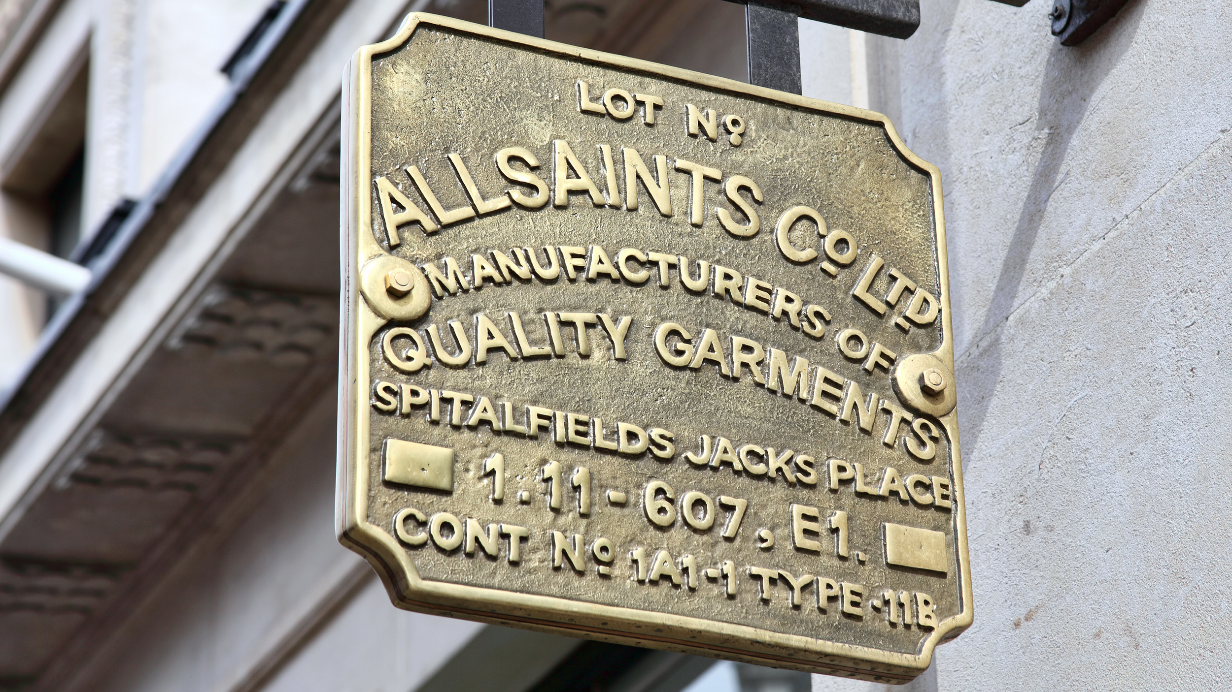
Regents street store signage
Why black and white works for the new AllSaints
The people in the campaign are varied, but the photography deliberately removes many of the things that could make the images feel disconnected. McLellan's black-and-white portraits are direct and remarkably restrained, allowing different ages, faces, professions and personal styles to exist within one recognisable visual system.
That is where the monochrome treatment becomes more than an aesthetic choice. Colour, location and elaborate sets can all introduce additional messages into an image, whereas the new AllSaints campaign reduces those distractions and puts character, clothing and expression at the centre. The result is a collection of individuals who remain distinct from one another while still appearing to inhabit the same brand world.
There is also a useful lack of polish to the casting. These are still carefully produced fashion photographs involving an internationally recognised photographer, stylist, art director, hair and make-up teams, so it would be misleading to describe the campaign as spontaneous or unconstructed. What AllSaints is doing instead is using that production to create something that feels less artificially perfected. Its own campaign language talks about a resistance to “polish and politeness”, and that attitude runs through both the casting and the images.
This matters because fashion advertising has become exceptionally good at manufacturing the appearance of effortlessness. AllSaints is attempting something slightly different by allowing irregularity and individual character to remain visible, while the consistent photographic treatment holds everything together.
The real measure of success will be whether that language becomes recognisable before the logo is consciously registered. If someone can encounter one of these portraits and instinctively understand that it belongs to AllSaints, the campaign will have achieved considerably more than simply looking good.
Why deleting Instagram makes sense this time
AllSaints' decision to clear its Instagram history ahead of this new chapter fits the same strategy. Deleting every previous post has become a familiar launch device for fashion, music and entertainment brands, to the point that an empty Instagram account can now feel like a fairly predictable prelude to an announcement.
For AllSaints, however, there is a stronger reason for doing it. Years of campaigns, product imagery and changing social strategies would have forced the new work to coexist with multiple versions of the brand at once. Removing the archive created an immediate dividing line and allowed AllSaints to rebuild the channel around a much narrower group of visual codes.
The important part is what came next. Rather than filling the space with visual noise, the new feed relies heavily on monochrome portraiture, typography, the Ramskull and a tightly controlled presentation of the collection. The number of ideas has been reduced while the frequency with which those ideas are reinforced has increased.
That is an interesting response to the current content environment. Brands have spent years being told that relevance requires constant production across an expanding number of platforms and formats, but more content does not necessarily create more memory. In some cases it does the opposite, as every new execution introduces another interpretation of what the brand looks and sounds like.
AllSaints appears to be making a case for concentration instead. The feed contains fewer ingredients, but each of those ingredients has a greater chance of becoming associated with the name.
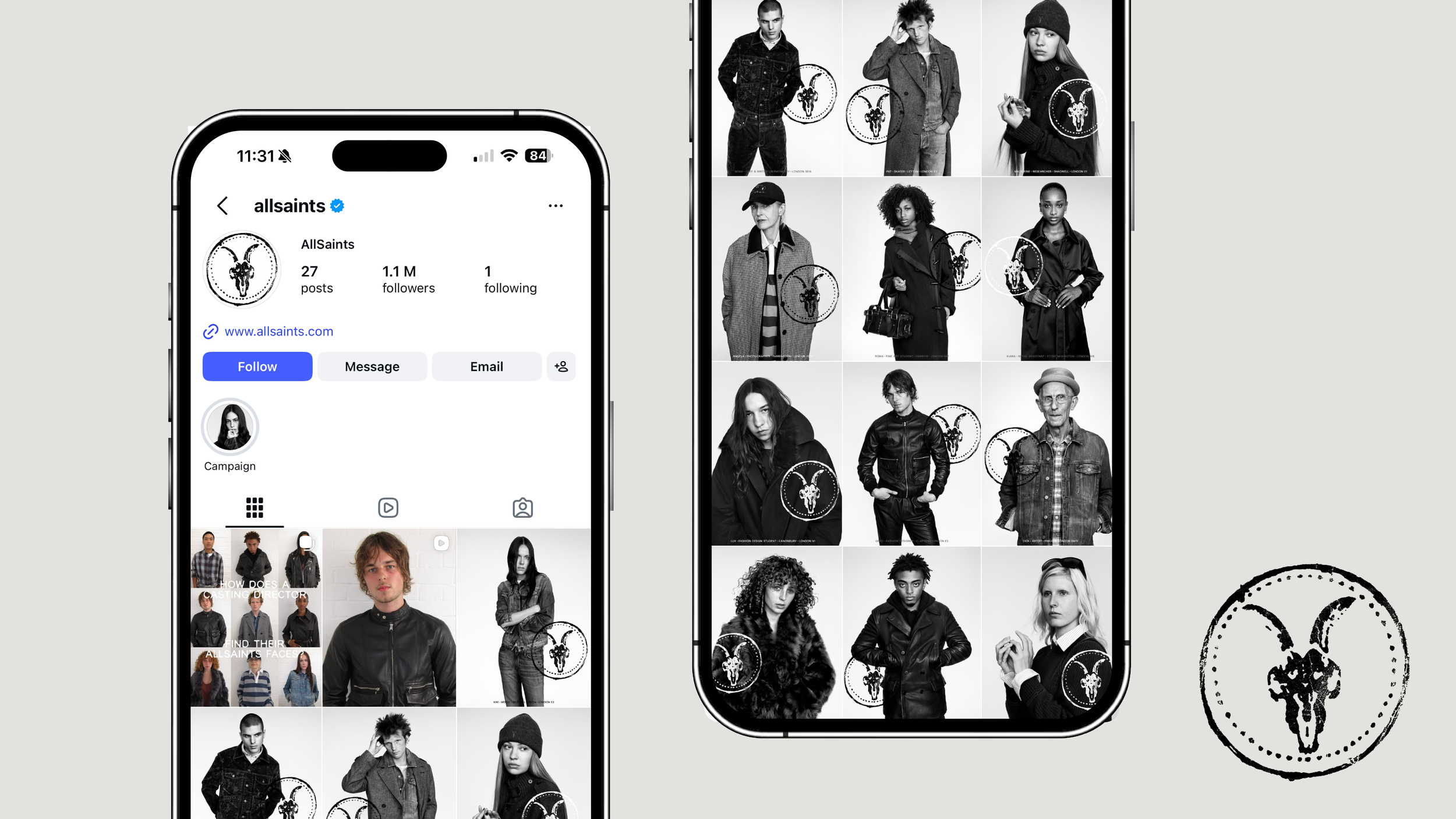
AllSaints official Instagram feed
The return of the Ramskull
Perhaps the clearest example of this concentration is the renewed importance of the Ramskull. AllSaints already owns something many newer brands would spend years and significant amounts of money attempting to create: an established symbol with recognition, history and memory attached to it.
Under Esh, the Ramskull is being pushed back into the foreground across clothing and visual communication rather than being treated as an awkward remnant of an earlier AllSaints. He has specifically talked about the value contained in this kind of iconography, and the latest clothing includes the symbol as part of the renewed brand system.
It sounds obvious that a company should make use of something consumers already recognise, yet established brands frequently become uncomfortable with their own distinctive assets. As leadership changes and visual trends move on, familiar symbols are often simplified, reduced or abandoned in pursuit of an identity that feels more contemporary. The result can be a beautiful new design system that looks impressive in a presentation but is considerably less recognisable in the real world.
AllSaints is going in the opposite direction. Even The Ram, its forthcoming physical publication, takes an existing symbol and extends it into language, publishing and culture. The ram is being asked to become more than a mark placed on clothing; it is becoming part of the organising idea around the wider brand.
That is a more interesting use of heritage than simply putting an old logo back on a T-shirt.
The biggest change may actually be the clothes
For all the attention given to the campaign, Instagram reset and visual identity, the most consequential part of the new AllSaints may be the product itself. Esh has said that around 90 to 95 per cent of womenswear has moved on under his direction, while stronger parts of the existing menswear offer have been retained and modernised rather than removed simply for the sake of change. He has also personally fitted hundreds of garments as the team reconsidered proportions, materials and finishing.
Denim has been consolidated around five continuing fits, while leather remains a central pillar but appears in updated colours and silhouettes. Archive styles and familiar categories such as biker jackets, boots and T-shirts have been reworked rather than abandoned, reinforcing the same philosophy visible in the identity: retain what deserves to be owned and improve how it is expressed.
This is important because fashion brands cannot reposition themselves through art direction alone. A company can commission a brilliant photographer, redesign its website and create an immaculate social identity, but eventually a customer picks up the jacket. If the promise created by the campaign disappears when they touch the fabric or try it on, the branding has failed at perhaps its most important point.
For a premium fashion business, materials, construction, weight, fit, hardware and finishing are therefore not operational details sitting separately from the identity. They are part of how the brand is experienced. Esh's apparent obsession with those details suggests AllSaints understands that becoming desirable again requires the clothes to support the same argument as the communication around them.
AllSaints Logo
The redesigned website is deliberately quieter
The new AllSaints website follows much the same logic. Autumn Winter 2026 is placed at the forefront, while familiar categories such as leather and denim are given room to behave almost like brand properties rather than simply sections of an ecommerce catalogue. AllSaints' own language emphasises its history and describes familiar pieces as being reconsidered with greater precision rather than presented as an entirely unfamiliar fashion proposition.
There is less pressure for the website to explain the brand through elaborate statements because the visual identity, product, casting and photography are being asked to carry more of that responsibility. This restraint is useful because companies that become uncertain about what they stand for often compensate with language, producing longer manifestos and increasingly elaborate explanations for work that should ideally communicate more of its meaning without them.
The introduction of AllSaints World is significant for a different reason. The editorial platform provides a home for campaigns, lookbooks and other cultural material alongside ecommerce, giving AllSaints an opportunity to build a wider context around its clothes rather than asking every communication to operate primarily as a sales message.
This is an important distinction for fashion brands. The strongest rarely behave simply as retailers. They create worlds involving photographers, musicians, designers, places, publications, references and people, allowing consumers to become interested in the culture around the product as much as the product itself.
AllSaints already has credible material from which to create that world. Its history stretches back to 1994, its identity is deeply connected with London and Spitalfields, and its retail spaces developed physical codes that many shoppers can still recall years later. Esh, himself born and raised in East London, gives the company an opportunity to reconnect those historic associations with a version of the city that feels lived rather than archived.
AllSaints is not becoming minimal. It is becoming concentrated
Looking at the monochrome photography, pared-back digital presentation and emptied Instagram account, it would be easy to describe the latest AllSaints as an exercise in minimalism. That misses what is actually happening because there is considerably more activity around the brand, not less. New product, new casting, new art direction, a redesigned website, an editorial platform, a physical publication and an expanded cultural programme are all emerging at roughly the same moment.
What has been reduced is the number of competing ideas.
AllSaints is concentrating its identity around a smaller group of assets it has a believable right to own: London, Spitalfields, leather, denim, music, the Ramskull, monochrome imagery and a particular kind of unpolished British attitude. The people in the campaign are particularly important because they give those ideas human form. Rather than telling us the AllSaints customer is a certain age with a particular income and lifestyle, the campaign asks us to recognise something less measurable but potentially more valuable: an AllSaints type of person.
That concentration feels timely. Brands have spent the last decade under pressure to expand almost every aspect of their communication, producing more campaigns, collaborations, content formats, platforms and opportunities to speak. The inevitable consequence is that some have become extremely active while becoming increasingly difficult to describe.
AllSaints is testing the opposite approach by asking what it already owns strongly enough to make unmistakable again. That does not mean every established company should return to its archive, restore an old symbol and photograph its next campaign in black and white. Heritage without relevance quickly becomes nostalgia, and nostalgia alone is rarely enough to build a future.
The more useful branding lesson is about selectivity. Consumers do not need to remember everything about a brand. They need to remember the right things, encountered consistently and distinctively enough that competitors struggle to appropriate them.
Seen in those terms, AllSaints is not stripping itself back because it wants to become quieter. It is clearing space around the things that make it recognisable so that they can become louder again. In a market overflowing with content, campaigns and increasingly interchangeable visual identities, owning fewer things more completely may prove considerably more powerful than continually inventing something new.
Frequently asked questions
Is AllSaints rebranding in 2026?
AllSaints has introduced what it describes as a new brand identity alongside Aaron Esh's first Autumn Winter 2026 collection. The changes extend across its campaign photography, visual system, website, social presence, product and editorial output. Esh has been reluctant to describe the project as a conventional rebrand, however, because the strategy is based on reclaiming and updating the strongest elements of the existing AllSaints identity rather than replacing them entirely.
Who is Aaron Esh?
Aaron Esh is an East London fashion designer and Central Saint Martins graduate who founded his eponymous label in 2022 before joining AllSaints as chief creative officer. His remit at AllSaints extends beyond designing the clothing and has included oversight of the website, copy, campaign direction and wider creative identity.
Why did AllSaints delete its Instagram posts?
AllSaints cleared its Instagram presence ahead of the launch of its new creative direction, allowing the company to establish a much clearer visual break from previous campaigns. The rebuilt identity centres on a more consistent set of brand codes, including black-and-white portraiture, stronger use of the Ramskull and the new Autumn Winter 2026 creative direction.
Who is in the new AllSaints campaign?
The Autumn Winter 2026 AllSaints campaign consists of 17 portraits photographed by Alasdair McLellan and styled by Katy England. Models appear alongside a street-cast group of Londoners including artists, students, a carpenter, chef, dancer, skater, publisher and people working elsewhere across London's creative and working communities. The cast deliberately crosses professions and ages, reflecting Aaron Esh's belief that the AllSaints customer should be defined by character rather than a narrow demographic.
Why is the new AllSaints campaign in black and white?
The monochrome photography provides a shared visual language for a deliberately varied group of Londoners. It also reconnects AllSaints with the darker visual character historically associated with the brand without directly recreating its campaigns from the 2000s. The consistency of the treatment gives AllSaints an opportunity to make its photography itself become a recognisable brand asset.
What is the AllSaints Ramskull?
The Ramskull is a longstanding AllSaints symbol that has been given renewed prominence under Aaron Esh. Rather than discarding an asset already associated with the brand, the new direction makes greater use of the Ramskull across clothing, visual communications and the wider creative identity.
What has changed on the AllSaints website?
The redesigned AllSaints website introduces the Autumn Winter 2026 identity across its ecommerce experience while giving renewed prominence to signature categories including leather and denim. The company has also launched AllSaints World, an editorial platform bringing its campaigns, lookbooks and wider brand content together in one place.
What is The Ram by AllSaints?
The Ram is a new physical publication being introduced as part of the wider AllSaints creative direction. The project extends the renewed Ramskull identity into publishing and gives the brand another way to engage with fashion and culture beyond conventional product advertising.